Introduction to the Timespace Map of New York
[2017-12-07: This has been updated in a big way.]
This summer I lived in New York for the first time, working for Venmo. Venmo’s offices are in the West Village, and I lived in Park Slope, so every day I would take the F train. As I was getting to know the city I would often look at this map:
Looking at that map every day got me thinking that so much of the geography of the city was defined by its public transit infrastructure, not by the lay of the land. What determined if two points were practically far or close depended not on how many miles separated them, or natural features like rivers that may lay between them, but whether or not it was easy to get from one place to the other on public transit.
I started thinking about how we could make a new map of New York, where distances between points on the map would reflect how long it took to get between them, not how far apart they were. It would project time onto the two-dimensional space of the map.
Without knowing how I would do that, I started collecting data. I took the 195 neighborhood tabulation areas of New York, geocoded them into Lat/Long pairs, and started hitting Google’s Directions API for each of the pairs of neighborhoods to see how long the transit route between them took. After doing this over many days in batches (because Google limits how many directions you can ask for any given day), I had a distance matrix that looked like this:
With the cells being the time (in seconds) it took to get between the two locations.
Next, I needed to figure out how to lay out these points in a two-dimensional space that reflected these distances in time. Turns out, this is a common problem in data visualization, and the most common tool is called multidimensional scaling. Running cmdscale (in R) on my distance matrix allowed me to lay out the “neighborhoods” of New York onto a 2d map with distances between them reflecting time.
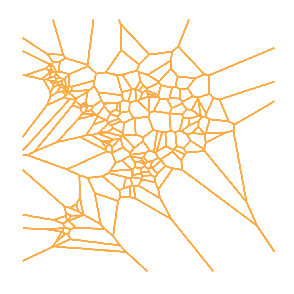
With just this information, about the best I could do was to create a Voronoi diagram of the points scattered about.
Cool, but we can do better.
I started thinking about these 195 points as a “skeleton” that I could build on. I wanted to project more information onto this map, but I couldn’t just go on adding points to my distance matrix (since the number of entries in the distance matrix goes up with the square of the number of neighborhoods), I had to figure out how to project an arbitrary Lat/Long pair onto this map.
I tried a few things out, but the method I settled on was LOESS regression as it was simple, made few assumptions, and could handle the obvious nonlinearities in the transformation between Lat/Long space and Timespace.
The model was simple (this is the model to predict one axis of the timespace dimension):
 model.dim1 <- loess(data = model.data,
formula = dim1 ~ lat + lng,
degree = 2,
span = span)
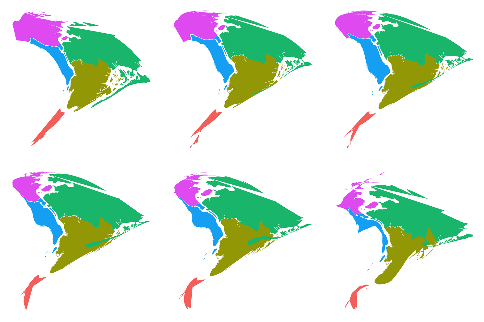
And the span term allows you to control how much impact the skeleton points have in “pulling” the new Lat/Long points away from their starting point. Here is a gif of different projections of the five boroughs with spans ranging from 0.99 to 0.2: (there a few errors in the borough shapefiles that I’m aware of…)
So what’s next?
Well, now that I have a method of projecting arbitrary Lat/Long pairs onto the “Timespace” dimension, I am working on doing it with other data sources. I’m starting with subways, but plan to add other features like roads, parks, and the like. Stay tuned!


